

7 Tips to Increase Landing Page Conversions
A landing page is where you convert your visitors into customers. When creating a landing page, you need to provide a seamless experience for your customers so they can see the value in your offering.
Once you determine what you want to accomplish with your landing page, think about your message. How can your offering solve customer’s problems?
Then do your keyword research. What do people search for when looking for solutions to the problems that your service or product can solve?
When you have your goal, message, and keywords, you can start creating your landing page. Once you put together all the elements you need, you can seek ways to increase your conversion rate.
Here are 7 tips that can help you increase your landing page conversions.
1. Images and Videos
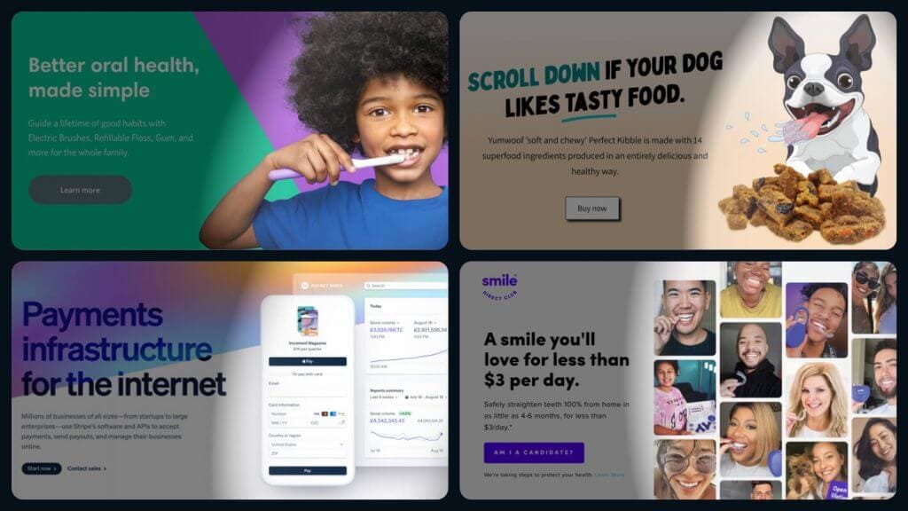
Using images with your signup form and CTA reinforces your message. However, you need to make sure that the image redirects your visitors’ attention to the form and CTA button.
Instead of generic photos, show your products and how they work. People need to visualize how they will benefit from your service/products. Images need to grab your visitors’ attention. Make them relevant, interesting, and captivating.
Using video on your page is a great way to boost your conversion rate. Videos will encourage people to stay longer on your page and increase engagement.
According to Unbounce, “Adding video to landing pages is one of the more effective ways to boost engagement and conversion rates. Marketers who incorporate video into their marketing campaigns experience 34% higher conversion rates. (Aberdeen Group)”
2. Headline
Your headline shows your value proposition. You need to clearly state the benefit of your offer in your headline so that visitors click the CTA. The headline should be short, concise and to the point, no more than 20 words. Don’t go into too much detail as you’ll provide more information in your subheadline.
InVision is a good example as they use a short, relevant, and simple headline. You can see their page below.

3. Subheadline
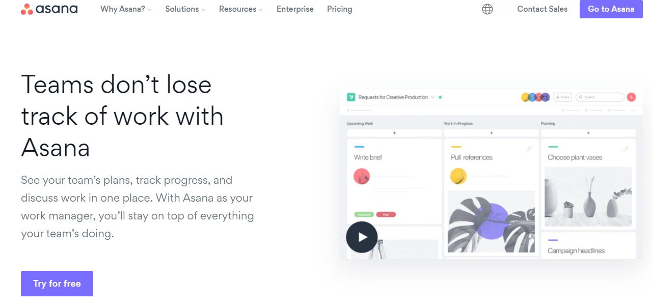
The subheadline is the introduction and plays a huge role in converting your audience. It highlights the main benefits briefly, mostly with bullet points or short sentences. Asana’s main headline, “Teams don’t lose track of work with Asana,” is sufficiently concise and attention-grabbing. In the subheadline, they inform the readers about the platform.
4. Copywriting
When writing your copy, you need to remember that people aren’t interested in your company. All they care about is “What’s in it for me?.”
Notice how Asana uses the pronoun “you” more than once, “See your team’s plans…you’ll stay on top of everything your team’s doing.” They show what their customers will gain if they choose Asana.
Your headline and subheadline should show the benefits to the visitors. You should speak more about your customers and less about yourself.
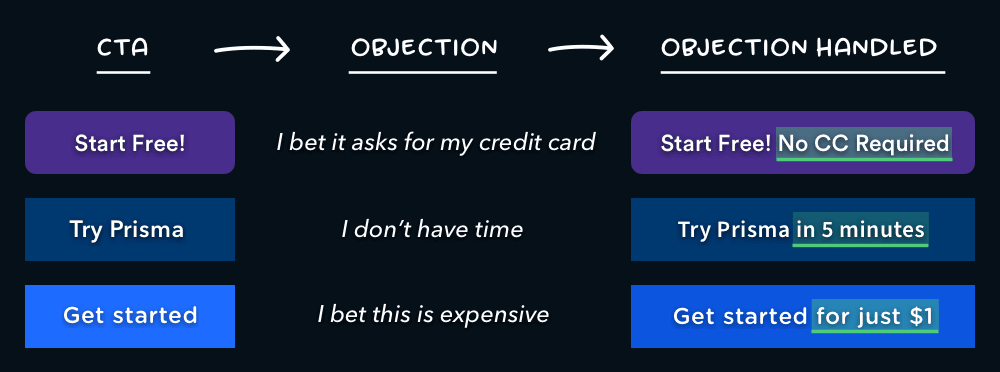
5. Call to Action (CTA)
Your call to action (CTA) is the most important part of your landing page. It’s your main conversion metric. You need to create a single and attention-grabbing CTA button.
Setting up compelling CTA buttons will help increase conversion rates. To improve your CTA click-through rate, try to be descriptive and appealing. As you can see in the image below, you can add a few words to your CTA to handle the visitor’s biggest objection to clicking.
6. Social Proof
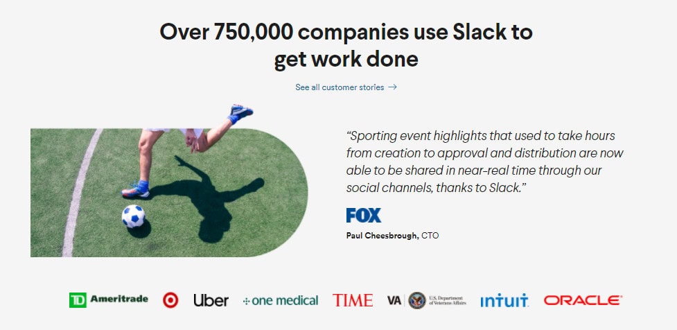
Testimonials help your visitors turn into paying customers as they add credibility to the value you’re promising.
Visitors are more likely to convert on your landing page if they see that others have used your products and are happy with the results. Social proof can be testimonials, reviews and partner logos. You need to use testimonials from real people, and people who are most relevant to your target audience. Check out how Slack uses a testimonial from a real person with their logo.
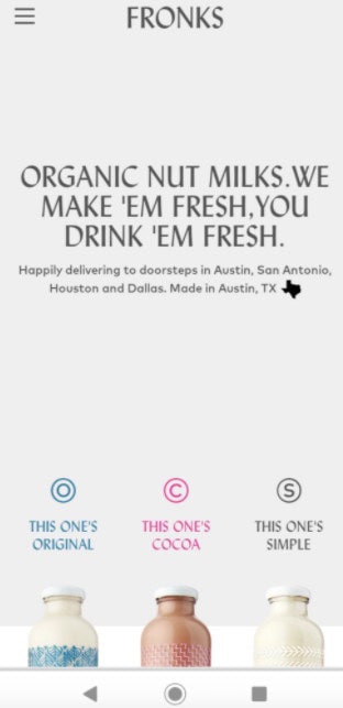
7. Mobile-friendliness
Your mobile landing page needs to be responsive. Keep your design simple and straightforward. Give your visitors every possible opportunity to convert, no matter where they’re viewing your landing page. Visitors should be able to move naturally through your page without getting overwhelmed.
For example, FRONKS has a simple mobile landing page and has a minimalist feel that many people will appreciate. The bold, clearly written header lets them know what FRONKS is offering.
Your landing page is the doorway to future customers. Improving it will positively affect the ROI of your marketing efforts. If you want to have a high-converting landing page, start by implementing the 7 tips above.
At Response DGA, we create a digital growth marketing strategy that is not only innovative and market-leading but, most importantly, delivers commercial success. Would you like to discuss a full-funnel digital growth campaign?


Write a Comment